Share

How to improve conversions
When we build a website for one of our clients, we usually have some sort of short-term and long-term goal in mind. This ensures we’re not designing and developing for the sake of it, but ensuring our clients get the most bang for their buck.
An eCommerce site for example, it is probably fairly obvious that improving sales would be a short and long term goal, for many other companies, it might be subscription/sign-up orientated, or for a service provider, it might be customers calling up and requesting a quote.
All these actions lead to a sale and profit.
At the end of the day our job is to ensure the longevity of our clients business and to eventually increase their revenue beyond what they pay us. Backed by research and data, we work out the best and most efficient way for our clients to gain revenue and increase their conversion rate.
A Conversion is the proportion of website visitors who take action or go beyond a casual website visit, and this action is profitable for the business. The Conversion Rate is measured by the number of customers who have completed the action, divided by the total number of website visitors. Leaving you with a percentage of customers who convert against the number of people who view the website.
There’s infinite possibilities for conversion types, most lead to direct revenue, but others play a long game and aim to get content and your brand in front of the right eyes, with the intention that they will refer or buy back in at a later date.
Some conversion types to consider;
- Product purchase (eCommerce)
- Request for quote
- Marketing content downloads
- Newsletter sign up
- Book in an appointment/service
- Demo request
- Webinar sign up
- Free e-book
- General contact form/questionnaire
- Podcast subscriptions
- Live chat interactions
- Feedback request
We’ve compiled a range of items for you to look at including or upgrading on your own website to improve your conversion rate. The smallest amount helps.
- Improve the content on your website and remove old text and images. These days, everyone is fairly impatient, if you have a significant amount of content on the page the chances are it won’t be read. Ensure your language is bite-size and easily palatable, be clear and concise and don’t try and over-do it. People can see through the bullshit.
We try and use this as our content hierarchy as a basis;
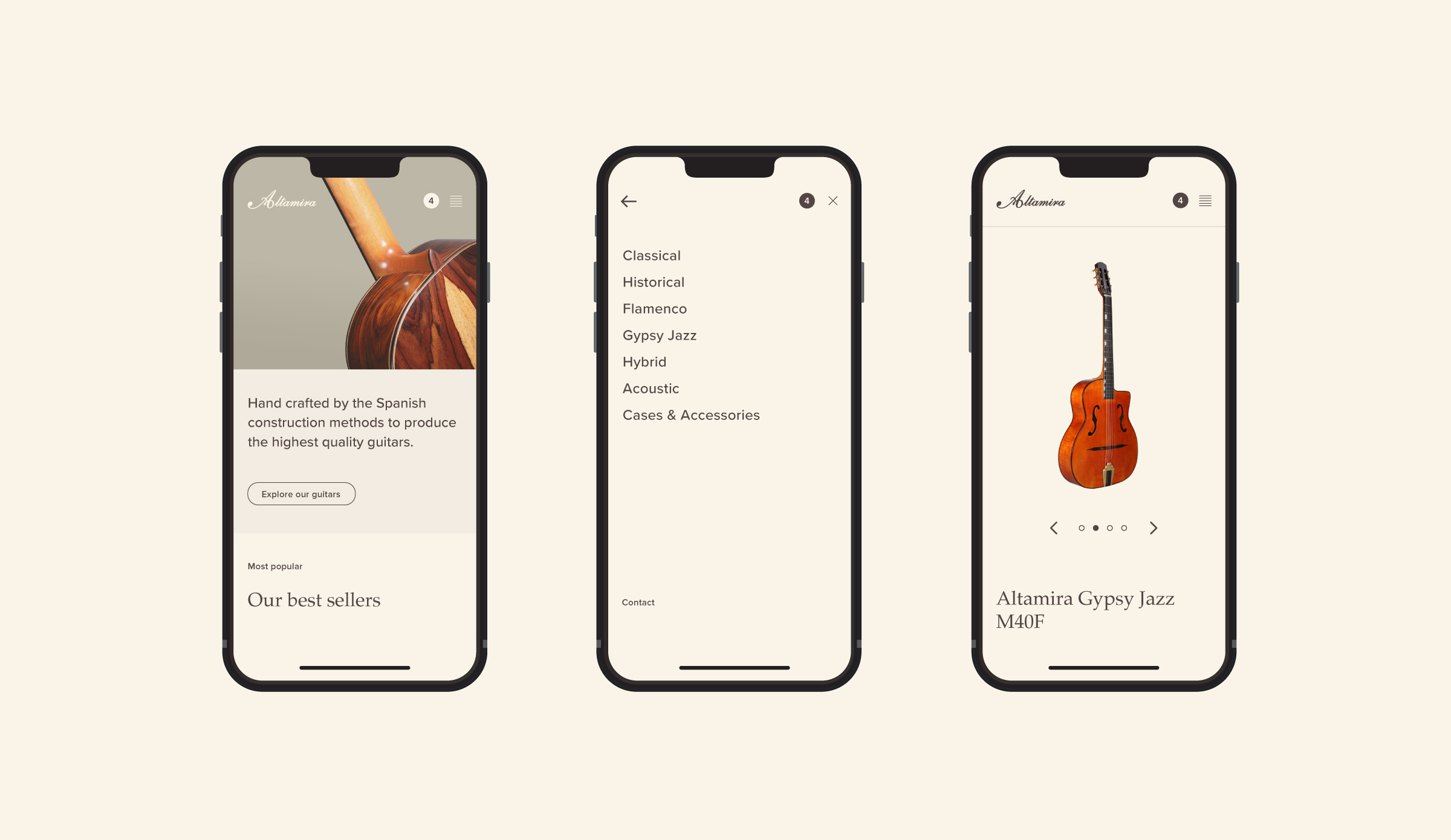
What is the product?/What it does > Benefits of product > Learn more/buy now > Is the product right for me?/social proof/reviews > More information > Final selling point > Footer. This way people know what your product is and it’s benefit before even seeing an add to cart button/CTA, if they aren’t quite sold yet, they’ll either leave and come back later, or read more to try and tip them over the edge to buying. It’s important to keep them on the page and continually reading content, the longer they remain on the page, the better the chance there is of them converting. - Improve the call-to-actions on your site. Ensuring your call-to-actions are clear and stand out against any noise on the page. We recommend two to three word Call To Actions like; “Sign up”, “Request a Demo”, “Add to Cart” or “Buy Now”. Ensuring you have a bright/contrasty colour as the background colour for your button.
- Know your product. Your website should reflect your product, if your product is expensive and better than your competitors, your website should show that. People should land on your page and instantly understand that it’s a premium product, this is achieved through clever design, language and white-space. It’s the polar opposite if you’re pitching your products to be the cheapest, think JB HiFi, Bunnings, Kogan, their sales pitches are they are the same product as everyone else, but cheaper. Their sites are congested and intentionally over-designed.
Quality website design and user experience is essential for any successful website. The fastest way to improve the performance of your site and, therefore, the conversion rate is to continually evolve and enhance your online presence. - A cheap trick we use is displaying third-party logos or testimonials on websites. The logo’s can be products you use for your business, customers who use your product or a mixture of both. Displaying well-established companies logos on your site gives authority to your website content, it implies you know what you’re doing and you’re successful and trustful.
- Ensure your website is built for speed. A growing number of pain points lately has been the speed of your website; from a user perspective, it’s a slow load time and getting impatient, or from broad terms, a slow website and Google punishing your site from search results. We use strict development techniques to gain as much speed as possible through Google’s Core Web Vitals. Investing in this (relatively cheap solution), may mean you appear higher in Google’s search results and get some free, organic leads.
After you’ve made some lasting improvements to your website, it’s important you track and measure accordingly. The easiest and the best option these days is Google Analytics. Apart from the total number of visitors that it provides, you can map your desired actions in your account and then measure the actual conversion rate of your website or pages.
This allows you to continue to improve and learn from any mistakes.
The items above in this article are fairly straight forward for any business wanting to do better. However, they do take some time to research, conceptualise and implement. Sometimes it’s best to leave it to the experts.
If you’re interested in learning more about our process, take a look at our case study for Cobram Estate and Wellgrove; our data-backed process of first understanding Cobram Estate and their pain points, to then rolling out user experience and purposely-designed website changes increased Cobram Estate’s online revenue by 36% in 3 months. We also overhauled Wellgrove’s User Experience, which resulted in a 10% increase in time spent on the website. This means the brand reach expands and there’s a greater chance of users using Call To Actions.
Take a look at the case study below via the big pink button.
OTHER READING
Subscribe to our Newsletter. Its never more than once a month.
Our Newsletter contains articles written by us and others on anything from websites, eCommerce, analytical data and conversions to design, user experience and even just flat-out cool things. We’ll occasionally plug new work and things happening here at Emporium Digital.
Leave your first name and email below, and come along for the journey.